Brand and website design for a founder-led sustainability executive search consultancy
Search With Purpose is a boutique executive search and leadership development consultancy for businesses that treat sustainability as strategy.
Impact
✅ A brand that reflects their senior, curated, and direct approach — without looking corporate or cold
✅ Clear, confident messaging that shifts the conversation from “filling roles” to shaping business impact
✅ A website that shows their value at a glance — so they spend less time explaining and more time connecting with the right clients
✅ A simple, conversion-focused structure that helps visitors quickly understand what they do — and take the next step
✅ Cohesive brand impact system — from lead magnet and email sequence to presentations and social templates — everything aligned, consistent, and easy to roll out
Before → After
The challenge
Fern was starting to lose work to competitors as well as in-house teams who hadn’t even been around when she started. Big executive search firms had developed sustainability arms, and this was eating Fern’s pie.
It wasn’t standing out despite having a strong offering.
She was launching a new leadership development programme — The Academy — and needed a brand that could carry more weight, turn heads, and position her as a frontrunner in sustainability leadership.
The pressure was on. And the current brand? It hadn’t kept up. Still DIY. A generic website, jargon-heavy messaging, and AI-written documents that sounded “correct” but forgettable. It didn’t reflect the clarity, confidence, or calibre of her work.
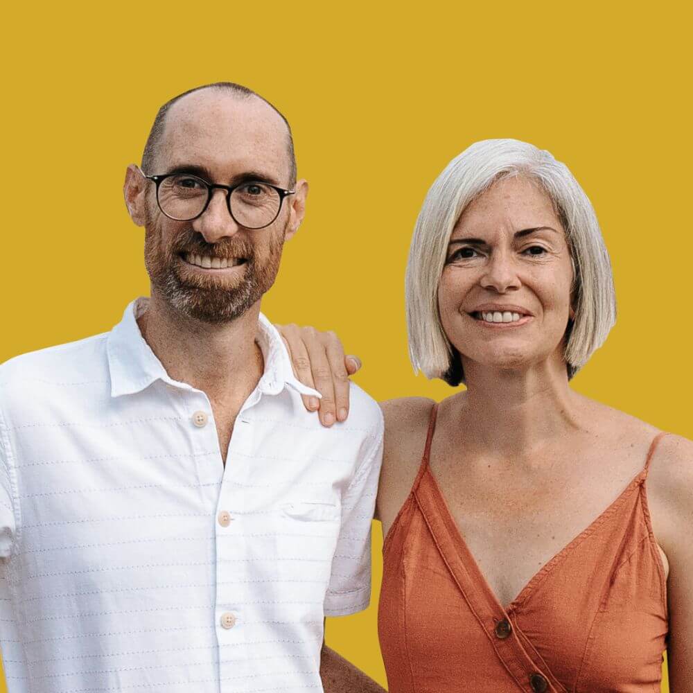
Search With Purpose had grown into a trusted partner for senior-level executive search in sustainability and ESG. But the brand hadn’t kept up. It was time to sharpen her positioning and show up like the benchmark she already was.
She was already setting the standard for what’s next — now was the time the brand showed it.
IMPACTFUL Website
SERVICE ICONS
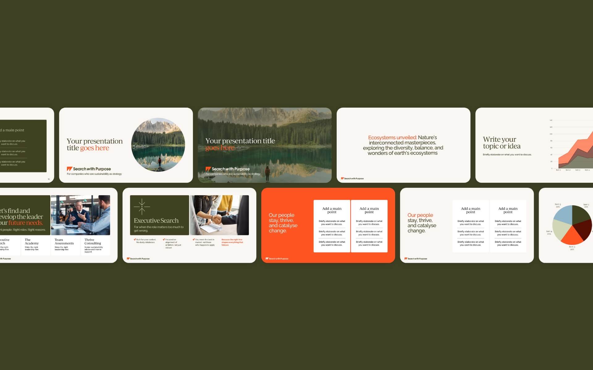
presentation template
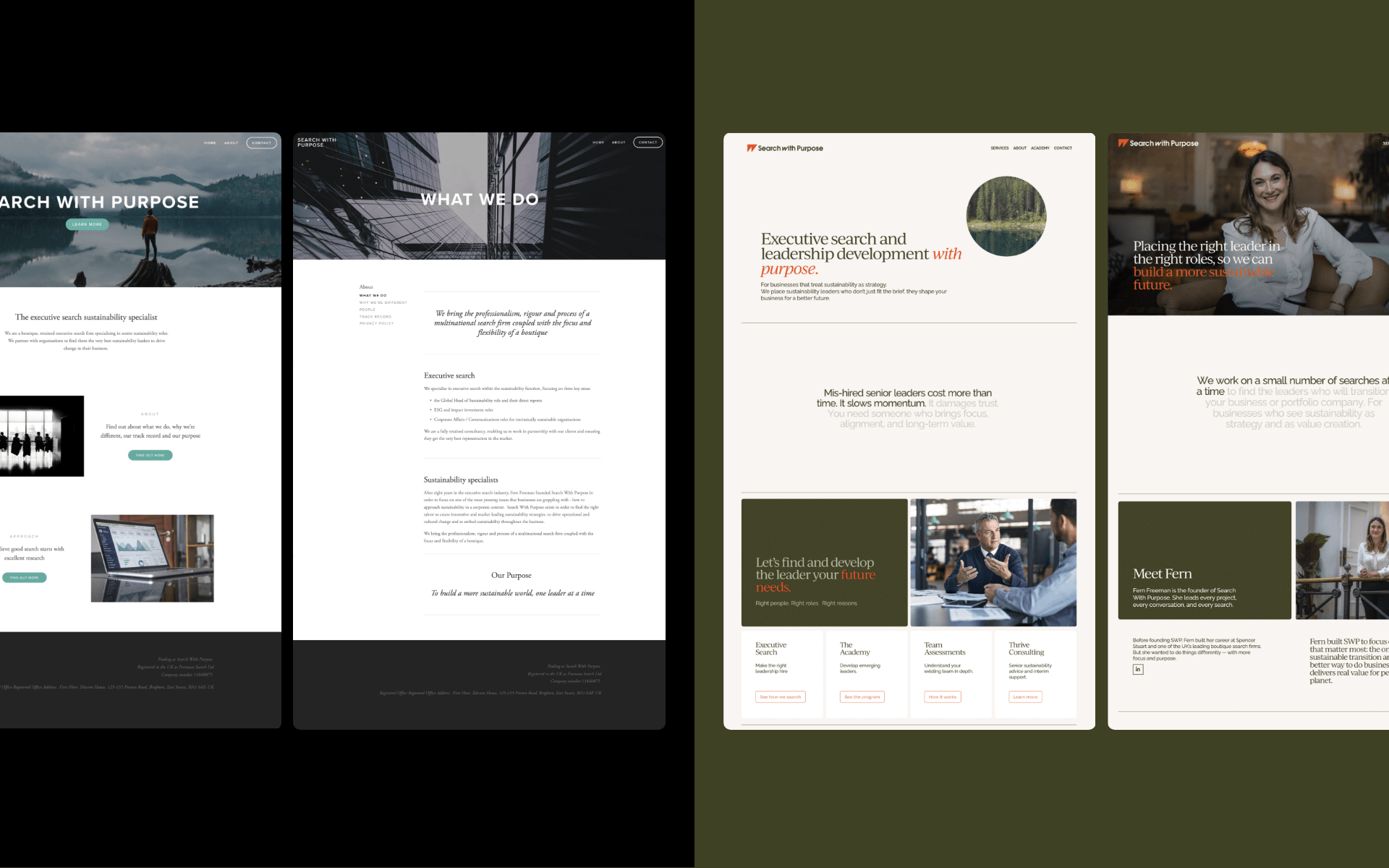
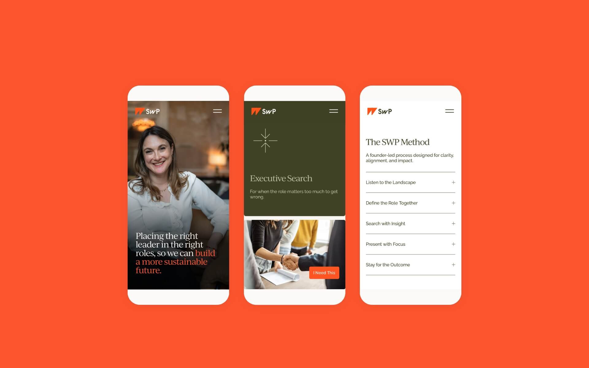
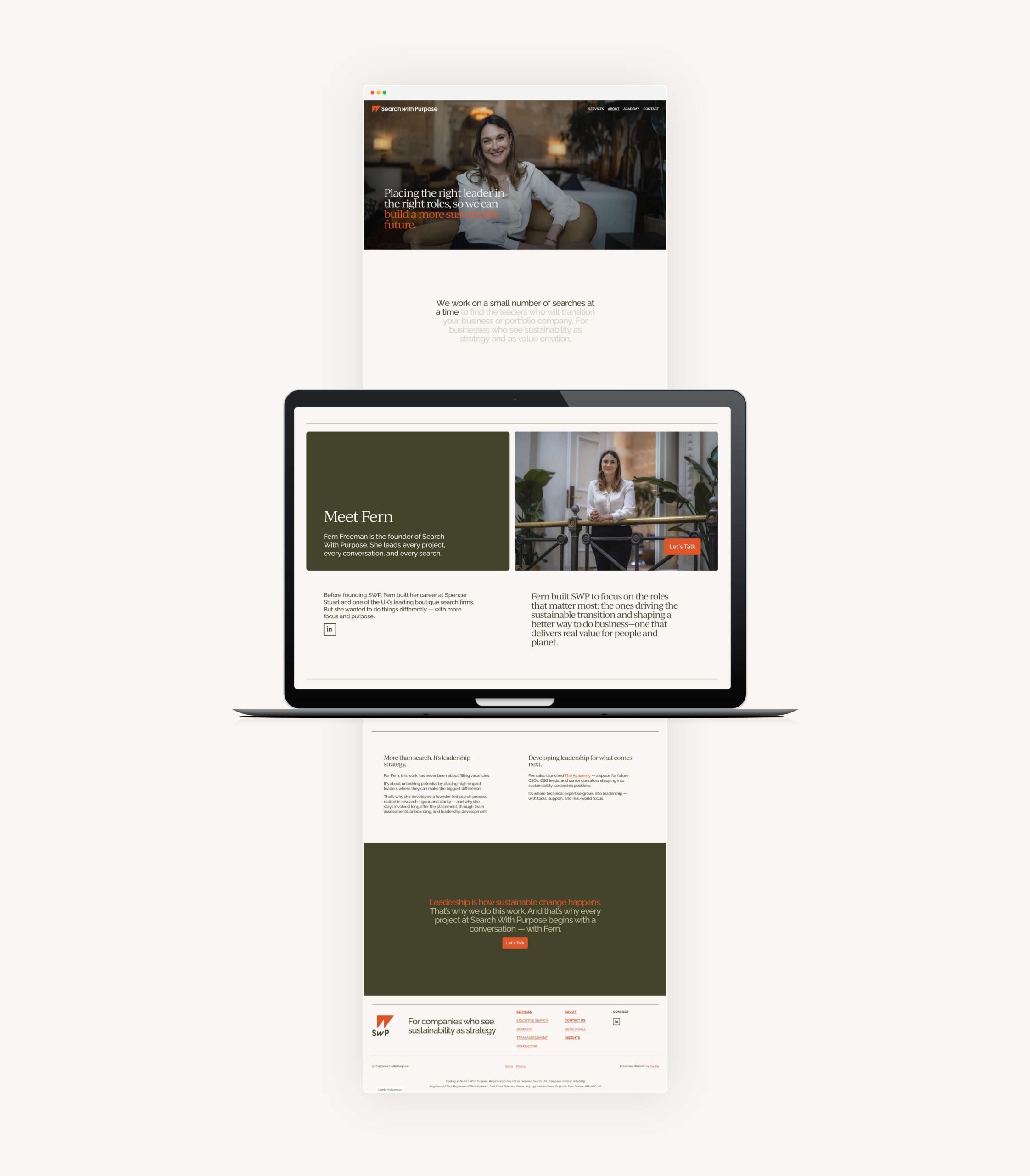
Responsive and MObile optimiseD squarespace website
Website ABOUT PAGE story flow
What we did
We helped Fern clarify her unique position in the market, uncover the hidden strengths of her offer, and identify what needed to shift to be seen as a leader — not just an option.
We kicked off the project with the BrandImpact™ Game Plan — our deep-dive strategy process that uncovers what makes a brand unique, relevant, and worth remembering.
From there, we built the brand from the inside out:
Positioning
We reframed SWP’s story from “executive search” to shaping sustainability leadership. Fern wasn’t just filling roles — she was curating the people who would drive long-term change. This shift helped sharpen the brand’s relevance, language, and impact.
Messaging + Tone of Voice
We stripped back jargon and made space for clarity, warmth, and confidence. The new messaging speaks directly to decision-makers — grounded, human, and distinctly SWP. Purposeful communication that reflects Fern’s calm authority.
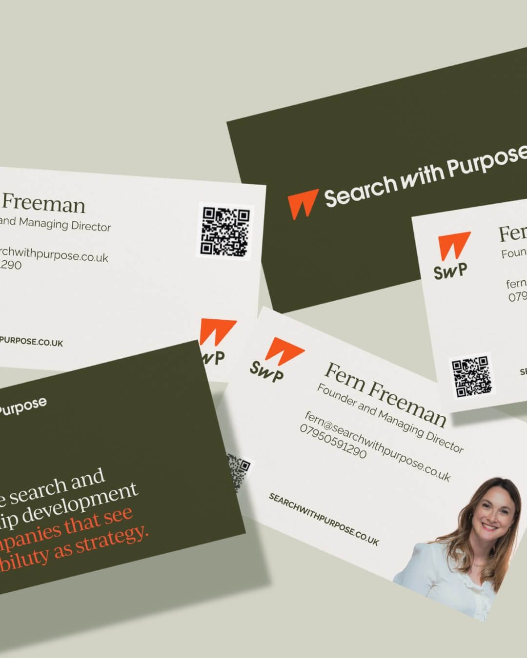
Visual Identity
We created a visual identity that’s clean, elevated, and unmistakably senior — without being stuffy. The colour palette and typography are confident but understated. Everything was designed to feel intentional, focused, and quietly powerful.
The logo
The oblique ‘W’ is angled to suggest forward motion and upward progress. That tilt isn’t just aesthetic; it embodies drive, momentum, and purposeful direction — the essence of a brand shaping the future of sustainability leadership.
Look again, and the symbol reveals a second layer: a quiet nod to binoculars. It’s a subtle but intentional reference to focused vision, long-term thinking, and the clarity needed in high-stakes executive search.
The result is a bold, minimal mark that avoids clichés and says a lot with a little: clarity, direction, and purpose. A perfect visual metaphor for a business that doesn’t just look for talent — but scans the horizon for what’s next.
We chose a rich orange tone to bring warmth and standout energy — balancing the brand’s calm, senior feel brought through by the sustainability-inspired deep greens and chalk with just enough character. The overall result is refined but distinctive; serious but not stiff.
Website Design + Structure
The new site is built in Squarespace to show SWP’s value at a glance — helping time-poor visitors quickly understand what they do, who they’re for, and how to take the next step. It’s streamlined, clear, and built for conversion.
We didn’t write this website to sound clever. We wrote it to sound like Fern.
Every section flows like a conversation. Because when your business is built on trust, the last thing you want is a site that reads like a corporate pitch deck.
We built a narrative that holds together from start to finish. It’s focused. It’s grounded. And it actually sounds like the person behind the business. Which, in a space full of vague jargon and templated recruitment copy, is what makes it work.
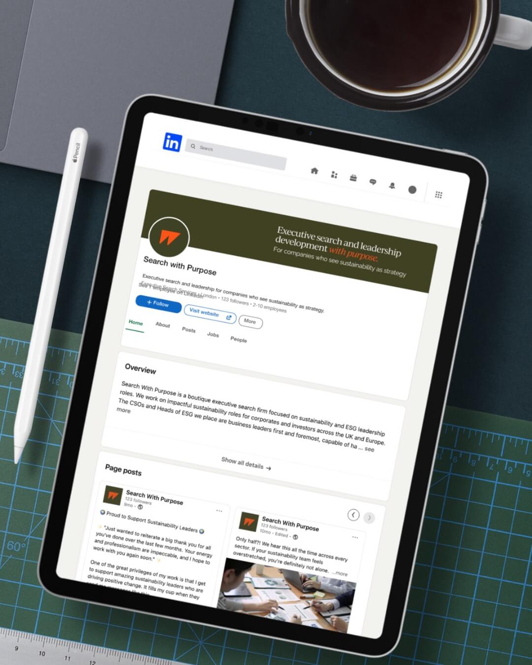
Brand System
Beyond the website, we created a full wraparound brand system — lead magnet, email sequence, presentation decks, and social templates — so Fern could launch with consistency, ease, and impact.
The Result
Search With Purpose now has a brand and website that reflect the calibre of the work — and the clarity of vision behind it.
It’s a brand built to support senior conversations, drive conversions, and position Fern as the go-to partner for sustainability-first leadership.
The whole system is designed to grow with the business. From executive search to team development, from founder-led storytelling to scalable systems — this rebrand gives SWP the clarity and confidence to lead from the front.